Subtle Patterns for Your Website

UI design is one of the critical success factors in any software product. This is the secret of market giants such as Microsoft and Apple. When it comes to web design it’s even critical. Most of the visitors may come to your website for the first time and they need to know what to do in the first glance.

The magic of a clean UI is its background color combination and patterns. It embosses the important content and focus users attention to the right content. However, designing such a background pattern could be challenging for most of the web designers.

You may be able to design good backgrounds, but look and feel is not the only concern here. You have to think about the dimensions, human eye movements and performance issues as well.

If you need a one stop place to find this kind of background patterns for your web design, Subtle Patterns come to save your day. Its website where you can find plenty of well engineered background patterns and beauty here is you can try them out in the same place.

subtle-patterns-for-your-website-7653677

How to Use SubtlePatterns?

  • Go to SubtlePattern Home page.
  • There you can see a list of patterns.
  • You can switch the viewing mode to thumbnails as well.
  • When you open a pattern, on mouse over you will be able to see the preview button.
  • Once you click on the preview button it will automatically apply the pattern to the background, so you can see how it’s going to looks like in your web page.
  • After selecting the suitable pattern you can click on the download button.
  • It will take you to a page where you can find one tile of image.
  • You can download it and put it as a background with appropriate duplication.

Once you go to the download page you will be able to see that image is having the smallest possible size without losing the quality and carefully designed to tile and virtually create large background image.

I hope Subtle Patterns will help your web design or any kind of multimedia application. If you want to download all the patterns in the website you can find the .PAT file, which can be opened in Photoshop, in the site footer.

If you like to contribute to the SubtlePattern you can submit your own, original patterns to share with everyone else. Give it a try too.

Tags: #Design #Web

Create Icons with Converticon

We use Icons for various different purposes. Mainly you’ll need nice looking icons to customize the desktop look and feel. If you are developing software you’ll need icons for more serious interface designing purposes.

In most of the cases you will need icon files in different sizes to match with the design. You can easily get it done with Adobe Photoshop but converting it in to ICO format could be a problem to you. If you need portable solution to get this kind of work done, again you will run in to problem with Photoshop.

To save your day, there is an online tool by the name ConvertIcon. I was introducing lots of online tools recently and as same as most of them, this is also a Rich Internet Application.

Quick Catch-up

  •  Rich Internet Applications – Redefining Web Experience

create-icons-with-converticon-8297938

How to Use ConvertIcon?

  • Visit ConvertIcon Home page.
  • There you can see the welcome message. Hit the Get Started Button to proceed.
  • Once you click on Get started it will give you a file browsing window.
  • There you can select icon files or image files which need to be converted or resized.
  • After selecting the files ConvertIcon will show you a preview of the image.
  • Then click export to save the image as an Icon.
  • Once you click on that, it will give you a dialog box with several size options.
  • Select the sizes you need and click on save as.
  • Give and appropriate file name and location and then click save.

The process is simple as that! If you selected several icon sizes still it will export one file, but it will contain all the sizes you selected as different pages. The best thing about this is everything is happening online and you never have to install software on your computer.

Best Way to Use ConvertIcon

The name Rich Internet Application rings a bell and you know that the best way to use such an application is within a SSB (Site specific Browser). You can get the maximum out of ConverIcon the same way.

Quick Catch-up

You can use this application for most of the icon creating and re-arrangements. If you have this application in a SSB you will never need any installed application to get the this work done. It’s a simple and complete solution work like magic.

Tags: #Rich Internet Applications

How to View Senders Information in Email?

When you receive an email, you can see senders email address and name in the header. But this is not really a reliable way to find the sender since those can be faked very easily by changing email headers. However email header contains a lot more information. Most of the email clients don’t display them to users not to disturb the user experience with technical details.

But still you can access that information easily in any email client and get accurate details about email sender including his mail exchange and IP address. Once you find the IP address you can find lot more details about sender such as his geographical location and with more effort, true identify as well.

how-to-view-senders-information-in-email-8549303

How to See Header Information in an Email?

This process is entirely depending on email client or service you are using. I’ll show you how to do it in Gmail and then you will be able to figure out how to do it any email service.

  • Go to Gmail and open the email which you need to analyze header and find original sender.
  • In top right corner of email you will find a drop down menu with the label More. Click on that.
  • There click on Show Original.
  • It will open another tab and show original textual version of email. There you can find all the details which are there in email header.
  • There you can find several Received: by statements. Last one represent the origin point of email and first one is the server which forwards the email to you.
  • If you take a closer look you will find more useful information there such as email client used by sender or whether he used a web interface, authentication and is this email a subscription of an email list.
  • Now you have the IP address or origin point of email. Based on that you can find lot more information using IP look up too.
  • You can use any online WHOIS tool to find location of IP address. Try ip-adress.com, its reverse IP worked well for me.
  • There you have better tool, email trace which you can find here. Copy and paste entire header details there and it will give you a detailed report about the sender.

However you might not be able to find the exact sender using this method due to data protection policies and laws. But still you can get a good enough idea about the original sender and path of email very easily. If you are using other email service or client all you have to do is simply get the original textual version of email. Then you can retrieve entire header formation in no time.

Tags: #Email

Generate a Strong Password Automatically

Strength of the password you are using in online activities has become a hot topic around the word. Everyday we are hearing lots of hacking and cracking and when you take a closer look most of them are due to easily predictable passwords.

Previously I was taking about how to create a strong password, what are the best practices and how to measure the strength of your password. There I introduced to you an online tool to calculate time to crack your password using average desktop computer.

Quick Catch-up

  • How to Create a Strong Password?

What if you feel like you can’t create a strong password for yourself? Still there are ways for you to have one. You can let a tool to auto generate one for you. GenerateMyPassword.com is a good option.

generate-strong-password-automatically-8027756

How to Generate Strong Password with GenerateMyPassword.com?

  • Visit the home page of GenerateMyPassword.com
  • There you can see a simple interface letting you to select character domain and length of your password. Better to include all types of characters.
  • After selecting those simply click on generate.
  • It will auto generate a password for you which is not there in any dictionary and need VERY long time to break.
  • Now the next big question, how to remember this. There you can see a button labeled as practice.
  • The best way to remember any phrase is repeated it several times till you get the grip.
  • Practice will take you through a repetitive process for you to get the grip of new password.
  • Once you get the grip, you will be able to type your password effortlessly in no time.

Now you have a very strong password and you found a way to remember it as well. The next step is going to settings of online account where you need to use this password and set this as new password. Then you can use this to login. Now the account is secured with a very strong password.

No matter how strong is the password, never use same password to all your online accounts. Never write them down physically or digitally, change them frequently and follow other best practices. Then you will be safe in WWW.

Tags: #Password #Security

New Gmail Compose Experience

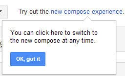
Today, when using Gmail I got a new message when I was trying to compose a new email. It was asking me to try out new composing experience. I always opt in for new things, so I decided to proceed. Here is the message I got. You might have already got the same message too.

gmail-new-composing-experience-message-8204378

Then I clicked on “New compose experience” link and it restarted whole Gmail. After that when I click on compose button, I could see the new composing window.

New Compose and Reply Windows

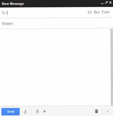
A good thing, they display on screen instructions to use new composing window. It appears as a chat window from right bottom corner. Here we go with the screen shot.

gmail-new-composing-experience-compose-window-8590083

You can see that composing window is simplified and less clattered. Most of the options are hidden in icons, even text formatting tool bar.  Previous drag and drop file attachment system still works. Here you can directly include image to compose window by dragging and dropping.

Best part here is you can compose an email while going through other email folders. You could not do this with the previous interface. By clicking on title bar you can minimize it like a chat window.

Then I took a look at reply window. Again they show on screen instructions. Same as compose window it’s highly simplified. By default quoted text are collapsed and uses icons to display message type. Here we go with a screenshot.

gmail-new-composing-experience-reply-9722233

Pros and Cons of New Gmail Compose Experience

UI is very simple, faster and focuses on what we use the most. This would be great for people who are typing lots of short emails. Ability to compose several emails simultaneously and browsing through other emails while composing adds an extra value to this. It’s like chatting, the only difference is you are sending an email.

However if you are a person who are typing few lengthy emails with lots of text styling, this might not be your cup of tea. You have to keep scrolling through the compose window and keep expanding text formatting tool bar. This would be a real pain for a busy person.

You can try this for yourself right in your Gmail box. If you feel like going back to previous composing window, you have that option in drop down menu in right bottom corner.

Try this out and tell us what you feel about this new change.

Tags: #Email #Gmail #Google

Google Trends Redesigned

Google Trends and Google Insight for Search are definitely in any bloggers’ top ten most used Google services list. Using Google trends you can get an idea about latest search trends in Google. For that they have country specific top list as well as global top list. Google Insight for Search could be used to analyze a trend for given keyword and their relative volumes.

However, there had been a question in my mind as to why Google maintains two different services like this. Basically both of them do the same thing in different ways.  Recently Google have merged both of those tools to make one powerful tool called Google Trends, a wise move. Now all the traffic that goes to Google Insight for Search will be redirected to new Google Trends.

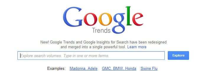
new-google-trends-homepage-8739599

What’s New in Google Trend?

The main change in new Google Trends is the totally revamped interfaces. Now they are clean and more Google-ish. In home page you have search box to enter search terms which you need to explore. If you enter comma separate list they will automatically go to comparison mode. Right below the search box you can find a slider which displays trends.

new-google-trends-hot-searchs-slider-4634390

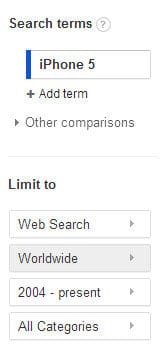
For a start, enter a search term and hit explore. It will take you to another Google-ish interface where you can explore trends for a given search phrase, almost as same as Google Insight for Search. On the left hand side you can add more search terms and compare location and time ranges. Below that you can find filtering criteria.

new-google-trends-search-term-and-filter-3444804

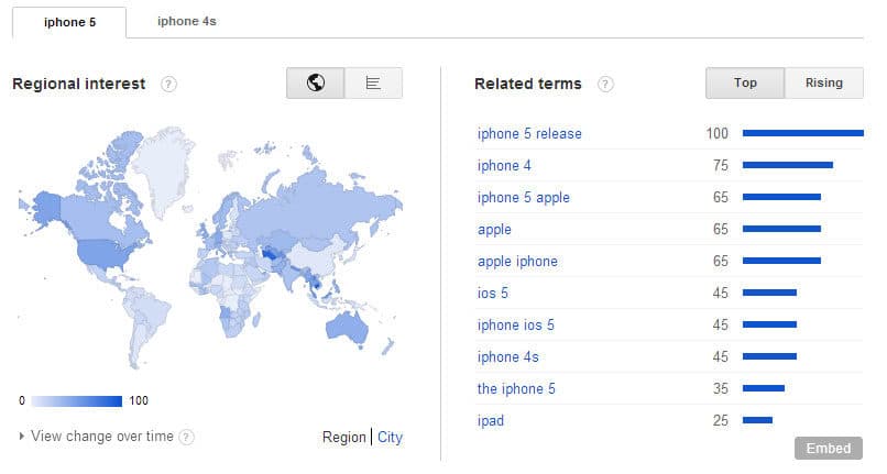
In page you can see a chart displaying trend for given search term over a period of time. Below that it shows regional interest, top terms and rising terms. In case you enter several search terms to compare them, data for each search term will be displayed in a well organized tabbed interface.

new-google-trends-tabbed-interface-9591750

New Google Trends is equipped with entire features of the previous Google Insight for Search in a much better interface. But what happened to Google Trends features? True, there is a slider in main page but is that it? No it’s not.

When you are in the ‘Explore Trends’ page, in the top left corner you can find a link to go to hot searches. There you can see hot searches and narrow down them by selecting a country out of four. Again everything is organized in a very clean interface.

new-google-trends-hot-searchs-4830436

The objective of this merge is developing more powerful and better search term and trend analyzer. I’d like to say “Yeah! It’s working”. So bloggers, internet marketers and anyone who like to analyze Google search trends try new Google Trends out and tell us what you feel as a comment below.

Tags: #Blog #Google

RightInbox – Get Reminders for Sent Emails

Previously I introduced you a browser plug-in which is tweaking Gmail and letting you to schedule and track emails. If you have already tried that you know it is getting integrated with Gmail seamlessly and working just great.

Quick Catch-up

  • RightInbox – Schedule and Track Emails

By the time I was writing above article email reminder feature was not there in RightInbox. In the case you want to get a reminder to follow up sent email or filter out sent emails which didn’t receive a reply in a certain period of time, you had to use another tool called Boomerang.

Quick Catch-up

  • Add Scheduling to Gmail with Boomerang

I always love to have one plug-in to do maximum amount of work. When you install many plug-ins your browser sometimes becomes less responsive and unstable as well. The good news today is RightInbox is now offering you email reminder feature as well along with Scheduling and tracking.

rightinbox-get-reminders-for-sent-emails-6461981

How to Set Reminder for Email with RightInbox?

  • Get the latest version of RightInbox plug-in for your browser.
  • Now go to Gmail and compose a new email.
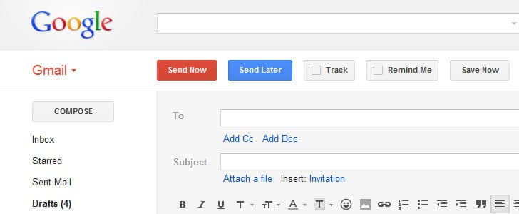
  • You are already familiar with Send later and track buttons. Now you have new button, Remind Me.
  • Clicking on that you can open several options to get reminders.
  • You can get unconditional reminder at a given time. There are few predefined time frames and you can set specific time as well.
  • If you want to get reminder only if you won’t get a reply check Only if nobody responds.
  • Then you can select how you want to get reminded. There you can several options such as return to inbox, star it, label it etc.

This new feature makes the RightInbox a complete tool which is giving you scheduling, reminding and tracking. Get your plug-in updated and enjoy the new features.

Tags: #Email #Gmail

Extension to Google and Bing – Slikk

Back in early 90′s there were very popular search engines such as Alta Vista, Yahoo, Excite and HotBot. In 1998 Google came in to picture. By that time it was not having mush popularity among surfers but after 15 years, everything has changed.

Surfers hardly ever use Alta Vista, Excite and HotBot. Yahoo search is still there. Google is the master and Bing is trying to give good competition. Search engine war has changed the face of internet search engines drastically in such a short time.

I’m really happy with Google search engine and using it many times every day. But is there any way to improve it further? When I was seeking a solution for this problem I came across with a search engine called Slikk. It’s getting search results from Google and Bing, then present them in much improved way. Slikk is under NOG spotlight today.

extension-to-google-and-bing-slikk-6572944

Attractions in Slikk.com

You can access this new search engine via URL Slikk.com. The interface looks like just another search engine. You have a text box to enter search query, a search button, types of search as tabs, check box with label “SearchBrowse” and few more buttons.

The first impression is search suggestions. It’s snappy, relevant and accurate. When I start typing some search, it narrows down the suggestion rapidly and feels better than Google suggestions. Once you submit the search query it will take you to search result, again with performance at a greater level.

slikk-homepage-1004355

It’s showing you the search result in conventional pattern with title, description and URL. Next to URL you have options to see cached web page and share it on social media. Next to that you have a link called Add it. Once you click on that, it will ask you to create an account. Once you are done with that page will be bookmarked in you MySlikk dashboard.

Search Browse

This feature is unique and very useful. It’s something similar to page preview in Google, but here you can actually browser the page right in the search engine. It’s having tabbed interface, so you can open several pages and browse them while you are in search result page.

MultiView

MultiView is automatically getting enabled when there are relevant results. What it does is, divide the web page into two sections and show different kind of results. Ex: web result and image result. You can select the type of secondary view from menu bat at the top.

You can switch to LionV mode from tabs. Once you do that, it shows all the pages which you have open as tabs. When you are in tabbed view you have social sharing buttons for Facebook and Twitter.

Note to Slikk Developers

Slikk Development team, you have done a great job and hats off for that. When it comes to technical aspect I have no complaint. But you should pay more attention to user interfaces. No point of having solid state-of-the art backend, without smooth and friendly UI. Especially, you can make MySlikk interfaces a lot better and simpler. If you manage to solve those simple issues, I believe you can make this a blast.

So people, try out Slikk, explore more features there and never forget to share new things you get to know about it. Comment thread is open for you, and subscribe to FeedBurner to get latest articles right in to your inbox.

Tags: #Bing #Google

Send Self Destructive Messages with PrivNote

Did you ever wanted to send a message to a friend whish will self destruct after he read it. This may sound like mission impossible move, yet there can be such a serious requirement. The solution is definitely not Email or a SMS.

Once you send a email to someone a copy of message is there in your outbox as well as inbox of the sender. In addition there can be lots of copies in the servers of the email service provider. The situation is same with the SMS as well.

When I was looking for a service which is giving you self destructive messages service, PrivNotes caught my eyes. Using this online tool you can send a private message to any one and it will get self destruct after reading.

send-self-destructive-notes-with-privnote-4652400

How to Use PrivNote?

The usage of this tool is very simple and you don’t even have to register or provide any personal information.

  • Visit the PrivNote home page.
  • There is a big text editor. Type your message there.
  • Check Notify me when this note gets read if it’s required.
  • If you check it, you will have to provide your email address
  • Finally click on Create note.
  • Then it will take you to another page where you can get a secured link to the message.

secured-link-1550249

  • There you can destroy the message without sending it or create another note.
  • You can share the given link to message with anyone.
  • Once someone accesses the link once, it will get self destruct. After that it won’t be available to read.

self-destrcution-6013888

At this stage of development this tool is not ready for any serious usage. This is more a fun tool yet. But I see a huge potential of developing this tool for serious business and professional usage, probably with mobile devices.

I leave this note as a request to the development to seriously consider upgrading this tool with better integration with other messaging services.

In the mean time you can try sending few messages with PrivNote and share your experience here with Notes Of Genius community.

Tags: #Security

Gmail in Google Search Results

When you are searching web with Google, usually it shows you different content from WWW. In very early stage it only had web search, but now it has expanded to image, video, books, blogs, shopping, news, flights and many more. They keep improving search results to show you what you really need.

However Google can show you only public web content. If there is private content at securely shared storage Google has no way to access them and show that content in search result. One good example is your Gmail inbox. What you are really looking for could not be a webpage, image or video, but an email you got from a friend.

Existing Google search engine is not capable of searching your inbox once you do a general search. It’s a huge amount of data. My inbox is having more than 10 GB of email. However, in the near future Google is planning to show you search result from your Gmail inbox as well to further personalize the Google search result.

gmail-results-in-google-search-queries-7074128

Try Gmail in Personal Search Result

This feature is still under lab testing and running on limited capacity setup. If you like to be a field tester for Google here is your chance.

  • Go to experimental Gmail Field Trial page.
  • Click the button ‘Join the field trial’.
  • And you are done!
  • You can come back to same page to leave field trial anytime.

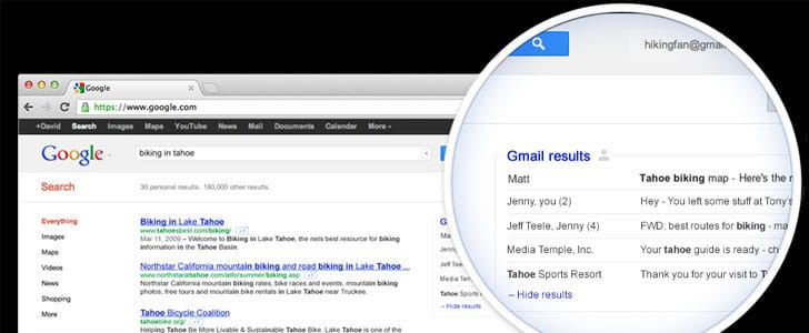
Once you enable this, there will be a new box in Google search result on right hand side labeled as Gmail result. There you will be able to see emails in your inbox, relevant to current search. Remember appearance of this box is conditional. You must be using “https://www.google.com” in English language and there should be relevant emails in your inbox for the current search query.

This is another major leap in Google search and unbelievable expansion of search domain. Practically this is merging Gmail search with Google Search. This would be great when you are searching for people and travel bookings.

Try the Gmail Field trial and never forget to share your feedback with us.

Tags: #Gmail #Google