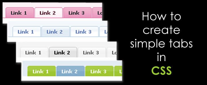
Hi folks! Today I am writing about yet another interesting CSS tutorial. When you are designing a website, you might have come across the requirement of adding tabs to your design. If not, you might need to do so in the future.
So when you need to add tabs how many of you consider designing it on your own? Most of you will take the easy way and download various libraries or ready-made tabs. But if that be the case, the power of customization is very limited unless you are an expert in manipulating scripts and styles.

But today I will be explaining how to create a tabular design on your own and customize it according to your requirements. Surprisingly this does require expert knowledge. If you can simply find your way through some CSS then you are good to go!
The First Step
As the first step, we need to create the tab menu, just like the one we see in ‘www.pizzahut.com’:

In order to do so we will need to create an unordered list with the tab menu elements. This is how it is done.
- Tab 01
- Tab 02
- Tab 03
- Tab 04
You will see the output like this.

Now we have to arrange these list items in to one line to make it look like a tabular menu. As explained in my previous article on creating a CSS Dropdown Menu, we will be making use of CSS style attributes ‘float’ and ‘position’ for this purpose.
Here’s how the styling goes:
body
{
        background-color:#000000;
}
#tab-menu ul li
{
        list-style: none;
        position: relative;
        float: left;
        width:150px;
        height: 50px;
        text-align: center;
        background-color: #cc99cc;
        line-height: 50px;
        border: solid;
        border-width: 1px 1px 0 1px;
        border-color:#ffffff;
}
#tab-menu li a
{
        text-decoration:none;
        color: #ffffff;
}
And this is how the formatted tabular menu will appear:

You will notice that in the menu, the menu elements do not have the bottom border.
border-width: 1px 1px 0 1px;
This is one of the styling tricks used to make the tabs look more realistic. You will understand why when you read along.
Creating the Content Area
Now we have to design the content areas of the tabs. This is done using elements.
I will add a DIV to create the common content area as ‘tab-content’ and inside that I am going to specify four DIV’s for the four tabs. Here’s how it’s done.
        Content in Tab 01 goes here.


        Content in Tab 02 goes here.


        Content in Tab 03 goes here.


        Content in Tab 04 goes here.
And apply some styling too.
#tab-content
{
    border: 1px solid #ffffff;
    background-color: #cc99cc;
    width:650px;
    height: auto;
    margin-left:40px;
    padding: 10px 10px 10px 10px;
    clear:both;
}

Here you will see that content of all DIV’s are displayed together. But what actually should happen is, only the content of the particular selected tab should be displayed.
For that we have to keep one tab selected by default as a start. In this case I’m assuming that my ‘Tab 02’ is selected by default and I’m displaying the content of Tab 02 while hiding the rest.
#tab-01{
        display:none;
}
#tab-02{
        display:block;
}
#tab-03{
        display:none;
}
#tab-04{
        display:none;
}
Also in order to exhibit that a certain tab is selected, we need to do a little change to the tab menu too. A simple CSS class will do the trick.
.selected
{
        top:1px;
}
Since the selected tab in this case is Tab 02 I’m going to do the following change to the Tab 02
And this is how our tabular design will appear.

Customizing Your Tabs
After you create the basic tabular design you can customize it the way you want.
Here I’m explaining you how to customize the tab menus with images. I have created two images of the size of a menu item in two different colors.
I am going to have the unselected tab in one color and the selected tab in another.
This is how the styling should be done.
Step 01: Remove border attributes from ‘li’ as follows.
#tab-menu ul li
{
    list-style: none;
    position: relative;
    float: left;
    width:150px;
    height: 50px;
    text-align: center;
    line-height: 50px;
}
Step 02: define a new class called unselected and add the image of unselected tabs.
.unselected
{
        background-image:url(images/menu-image-unselect.png) ;
}
Step 03: add the image of the selected tab to the ‘selected ’ class
.selected
{
    top:1px;
    background-image:url(images/menu-image.png) ;
}
Step 04: specify the classes in the tab menu as follows.
- Tab 01
- Tab 02
- Tab 03
- Tab 04
Voila! Your customized tabular design will look like this:

In my next tutorial I will explain how to animate this tabular design using Javascript.
In the meantime download the source from Here and try this out for yourself. And do not forget to leave your feedback too.
- Hardware: Intel Core i5 2nd Gen // 4GB DDR2
- OS: Windows 7 Home Premium // 64 Bit
- Browser: Google Chrome Version 23.0.1271.91 m
Tags: #CSS #Web
