Nokia – Story of Finnish Mobile Giant

Nokia is one of the world most famous and the oldest telecommunication company. They produced networking equipment mobile phones, smart phones and mobile computers. They become popular in to public mainly because of their mobile phones. Back in 1990s they were the company which was holding the largest part of the GSM mobile phone market. Before that they were going great with the 1st and 2nd generation mobile phones as well. Their smooth combination of hardware and software let them be the mobile phone market giant for decades.

However with the trend of mobile smart phones and table PCs, lots of competitors came in to market including Apple, Samsung and HP. They came up with competitive products especially in smart phones. The mobile phone giant was not doing so well in this trend though it was taking the lead in many of previous mobile devices trends. Therefore its popularity was falling. Recently they have taken some steps to be back on the track with other competitors and they attracted the public interest back to Nokia.

nokia-story-of-finnish-mobile-giant-1351015

Company History

Early time

The mother country of the Nokia cooperation is Finland and then it expanded to hundreds of countries with manufacturing network. It was originally founded back in 1865 and by that time they were producing paper under the Russian empire. With the improvement of telecommunication Nokia produces its very first electronic device which was for nuclear plants back in 1962. In 1970s Nokia was more focused on developing telecommunication devices including telephone switches and many other highly sophisticated telecommunication equipments. Mainly they were involved in improving communication security by applying encrypted protocols to communication mediums.

Mobile Telecommunication Industry

In the early stage of mobile telephones which was 0G Nokia was developing mobile communication devices for military purposes. With the 1st generation mobile communication technology Nokia released Mobira Senator which could be considered as Nokia’s very first commercial mobile phone. In that time mobile phone was not really mobile, it was a considerable huge device. So Nokia was in a mission to make it smaller and make it actually a mobile phone. And they were taking the lead in 2nd generation and 3rd generation mobile trends with their amazing technology.

Mobile Phone was not the only manufacturing in Nokia. Other than mobile phones there were producing various different mobile devices including notebook PCs, communicators which is an original concept of Nokia itself.

Company Growth

Most of the time Nokia was doing great and they were growing in financial side continuously. In history Nokia could acquire many other companies and expand their telecommunication empire. In 1990 Nokia Company was more focused on telecommunication industry and taking their focus away from non-telecommunication businesses. Down this path Nokia became the world’s largest mobile phone manufacturer in late 1990s. In early 2000s company was facing tight market competition and most of the time it could not take the lead as it used to do. Therefore financial status of the company was started to getting weaker and stock price was also falling.

Technology

Operating system

One of the most attractive features in Nokia mobile phone was its operation system.  The OS that used in early mobile phone was commonly known as Nokia OS. By that time mobile Phones were having black and white carbon display (monochrome).  Therefore the aesthetic application was limited. Yet, Nokia OS was doing a great job and stand out among entire other OS available in that time with its extra smooth user-friendly experience. They have extended same OS to the early versions of color display mobile phones and they worked just fine with them as well.

With the improvement of mobile devices Nokia started using the Symbian OS by Symbian LTD. Back in 2008 it was bought be Nokia itself.  Symbian OS was giving many options to its user to select the way it should appear in the phone display. the most popular one was windows desktop like icon based menu. It allowed the user to organize the icon in folders and feature the desired icon in the standby screen as well. Symbian OS powered Nokia mobile phones for long and it contributed to its popularity in a significant way.

Down the time the requirement of Mobile smart phones was getting complex and many competitors were addressing those with their new mobile operating systems. Therefore Nokia decided to move to new linux based operation system which is MeeGo. The later version of Nokia N series was powered by MeeGo OS. MeeGo is an open source OS and it gave the ultimate flexibility to latest Nokia mobile devices. However according to my personal point of view it could not give the competitive edge for Nokia to stand out in Smart phone market.

Recently Nokia has released mobile smart phone with Windows Mobile OS which is one the latest and the most versatile mobile OS. This is one of the significant steps taken by Nokia to stand out in Smart phone market. The latest Nokia Lumia 800 is powered with windows mobile OS 7 and it was launched in 2011 October. Nokia has invested huge amount of money and effort in this device and having high hope about its success.

Online Service

Nokia is providing various different online services to its customers. The most significant one is Nokia Ovi dashboard which is an online portal to many other services. The main services that offered in here were N-Gage mobile gaming service and Ovi Maps for Nokia devices with GPS. The Ovi map is an amazing product that converts your mobile start phone in to high end navigation system. It getting updated frequently and cover all major continents with turn to turn voice guidance. Additionally Nokia online service provides and online backup system for customers where they can save their important information and could be transfer to any other Nokia mobile phone instantly. There is an email service provided by Nokia as well.

Multimedia Capturing

In the early stage of mobile phone which can capture still images Nokia was the leader and they provided state of art capturing devices embedded with the mobile phones. Sometimes ago I used a Nokia 7650 which came with 0.3 megapixel camera, yet produced good quality still images with its software enhancements. Today it has developed to 12 megapixel embedded cameras with sophisticated Carl Zeiss optics which allow the users to capture professional quality still images and video with their mobile phone.

Device Milestone

  • Mobira Senator: Nokia’s first mobile phone released back in 1982, 1G brick type with monochrome display.
  • Nokia 100: Very First original series phone released back in 1987, 1G candy bar type with monochrome display.
  • Nokia 1011: Nokia’s very first GSM phone released back in 1992, Candy bar type phone with monochrome display.
  • Nokia 1600: Color display phone with 96px display, GSM phone with candy bar design.
  • Nokia 6600: came with a 0.3 mega pixel camera.
  • Nokia 7650: Slide type phone came with 0.3 mega pixel camera.
  • Nokia 9000 Communicator: Released in 1996 with Clamshell design.
  • Nokia E72: Came with 5 mega pixel camera back in 2009
  • Nokia N70: First release in N series in 2005
  • Nokia N85: Two way slide phone customized for music came with 5 mega pixel camera and in built GPS
  • Nokia N8: Touch screen phone came with 12 mega pixel camera which can capture 720p HD video
  • Nokia Lumia 800: Latest release in 2011 powered by Windows Mobile OS 7.

Market Competition

Apple iPhone

Apple was one of the most evident threats to the Nokia Empire and it was able to take away large part of Nokia users already with their product Apple iPhone which is one of the most popular consumer electronic devices in this millennium. They have their state of art touch screen powered hardware system and one of the most aesthetic looking operation systems which is apple iOS. At this moment iPhone could be identified as the world’s most popular smart phone and they have build a new empire in mobile phone market within a short period of time like Nokia used to have for decades.

HTC

HTC is one of the oldest mobile phone manufacturers and gave birth to, many smart phones long time ago. Recently they have released attractive series of mobile smart phones with latest OS Android and Windows Mobile OS 7 which Nokia also using for their latest devices. According to the latest statistics HTC phones are reaching its maximum popularity as represented by sales and almost hitting iPhone and surpassing it if you consider entire series of HTC phones becoming a good competitor to Nokia Empire and newly built Apple Smartphone Empire too.

Samsung

A south Koran company which produces many consumer electronic products came in to mobile smart phone competition, more than a competition is a war.  They have recently come up with series of touch display smart phones with attractive OS like Android and its customized version. Additionally they are equipped with latest stills and video capturing devices which capable of recording even 720p HD video. Of course they are giving good competition to entire mobile smart phone manufactures including Nokia.

Future Plans

Windows Mobile OS 7

The immediate next plan of Nokia is it seems manufacture amazing devices in collaboration with Microsoft with their Windows Mobile OS 7. Nokia Lumia 800 is the latest attraction in this stream. Additionally they have investing huge effort in design aesthetic smart phone design like they always used to do with their entire series of phone. Even if you go back in to 1990s Nokia phones were always smart looking and it was always prestigious to use one. They are going to take the same advantage back again with innovative designs. They have recently officially released a video documentary about the design of Nokia Lumia 800.

Hardware Improvements

The next feature they will probably be focused on is the hardware especially Touch sensitive screen, accelerometer, altimeter and GPS device. The main attraction in iPhone was its highly accurate touch screen and according to my experience no one could come up with that accurate touch screen so far which made the iPhone Empire untouched. Currently HTC and Samsung have come up with excellent touch-screens so Nokia also have done and nice job with Lumia 800, yet they need to come up with more WOW stuff to stand out in the market.

Nokia already having amazing GPS based navigation system which is Ovi Maps and never seen anyone else provides something similar. They can improve the hardware capabilities in GPS units in side forthcoming Smart phones and at the same time improve Ovi maps with more up to date details and features including 3D views and real Street views.

Concept Smart Phones

Nokia has published many smart phone concepts in their official web site including The Morph Concept which is smart phone comes as a hand band and ear piece. It will be flexible and can shape in to a normal phone as well.

Additionally Nokia has conceptualized mobile device to monitor the environment conditions, personal health conditions and weather conditions. This could be innovative concepts which may reshape the human civilization and its continuation.

Tags: #Mobile #Nokia

How to Manage Storage in Android Smartphone?

Managing storage space in Smartphone or tablet is not as easy as in a computer. There are temporary files, app data, and downloaded installation etc. consuming huge amount of storage. If it was a computer you could have done a disk clean up or use another tool to get it done. But in a Smartphone it’s not the case.

There are several applications on Google play which you can use to clean unnecessary files in your Android Smartphone. I tried few of them but none worked well for me. So finally I decided to clean up storage in my Android phone myself ‘like a BOSS’! For this all you need is a good file browser. My best recommendation is Storage Analyser. It’s giving you file browser, show size of each folder, sorting and file manipulation. That’s all we need and let’s get started!

how-to-manage-storage-in-android-smartphone-7668802

Getting Started With Storage Analyser

  • Download and install Storage Analszer on your Smartphone or Tablet from Google play
  • As usual you should take a look at preference.
  • You can change the UI in display settings. For most of the people default will work.
  • In expert options you can use SU rights and set it to show system partitions.
  • Now go back to main screen. Down there you have 3 buttons to switch storage type, filter and sort files. For a start set it to SD card and Sort by size.

How to Clear Up Unwanted Files with Storage Analyser?

How to identify the most space consuming folder is the first step and Storage analyser will do it for you. We already set folder listing to sort by size. So you will get biggest folder at the top once you open the app.

Images, Videos, eBooks etc

Browse the space consuming folders and check whether there are any images, videos, books etc you don’t want to keep. If so remove them. You can do it right here in Storage Analyser. Tap and hold any file or folder and it will show you a menu where you can copy, cut and delete them. For multiple selections, use checkboxes in front of folders and files.

Temporary files, Cache etc

Removing images, videos etc might not solve your problem. The major space consuming items are temporary files, cache etc. Most of the applications are providing you options to clear them. But for that you have to open several applications and go through many options. You can clear them easily with Storage Analyser. Before that you should know how to identify them.

Generally you can find those in SD card with name cache or temp along with application name may be. If those are consuming huge amount of space, you can clear them up.

Then you can clear cache of YouTube, DropBox, and Maps etc. For that you have to go in to Android -> Data in your SD card. If they are consuming significant space, you can clear them up as well.

  • Hardware: Samsung Galaxy Nexus
  • OS: Android 4.1.1

Now your phone doesn’t have unwanted images, videos and eBooks etc. And you have removed space consuming cache and temporary files as well. Now you can enjoy well managed storage space in your phone. Never forget to share new things you get to know specially with different devices and different versions of Android.

Tags: #Android #Smartphone #Storage

How to Create Simple Tabs in CSS

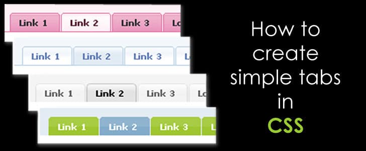
Hi folks! Today I am writing about yet another interesting CSS tutorial. When you are designing a website, you might have come across the requirement of adding tabs to your design. If not, you might need to do so in the future.

So when you need to add tabs how many of you consider designing it on your own? Most of you will take the easy way and download various libraries or ready-made tabs. But if that be the case, the power of customization is very limited unless you are an expert in manipulating scripts and styles.

main-banner-1309938

But today I will be explaining how to create a tabular design on your own and customize it according to your requirements. Surprisingly this does require expert knowledge. If you can simply find your way through some CSS then you are good to go!

The First Step

As the first step, we need to create the tab menu, just like the one we see in ‘www.pizzahut.com’:

example01-1565567

In order to do so we will need to create an unordered list with the tab menu elements. This is how it is done.

        
  • Tab 01
  • Tab 02
  • Tab 03
  • Tab 04
 

You will see the output like this.

example02-4107855

Now we have to arrange these list items in to one line to make it look like a tabular menu. As explained in my previous article on creating a CSS Dropdown Menu, we will be making use of CSS style attributes ‘float’ and ‘position’ for this purpose.

Here’s how the styling goes:

body
{
        background-color:#000000;
}
#tab-menu ul li
{
        list-style: none;
        position: relative;
        float: left;
        width:150px;
        height: 50px;
        text-align: center;
        background-color: #cc99cc;
        line-height: 50px;
        border: solid;
        border-width: 1px 1px 0 1px;
        border-color:#ffffff;
}
#tab-menu li a
{
        text-decoration:none;
        color: #ffffff;
}

And this is how the formatted tabular menu will appear:

example03-6881124

You will notice that in the menu, the menu elements do not have the bottom border.

border-width: 1px 1px 0 1px;

This is one of the styling tricks used to make the tabs look more realistic. You will understand why when you read along.

Creating the Content Area

Now we have to design the content areas of the tabs. This is done using elements.

I will add a DIV to create the common content area as ‘tab-content’ and inside that I am going to specify four DIV’s for the four tabs. Here’s how it’s done.

    
        Content in Tab 01 goes here.
    
    
        Content in Tab 02 goes here.
    
    
        Content in Tab 03 goes here.
    
    
        Content in Tab 04 goes here.
    

And apply some styling too.

#tab-content
{
    border: 1px solid #ffffff;
    background-color: #cc99cc;
    width:650px;
    height: auto;
    margin-left:40px;
    padding: 10px 10px 10px 10px;
    clear:both;
}

example04-2477971

Here you will see that content of all DIV’s are displayed together. But what actually should happen is, only the content of the particular selected tab should be displayed.

For that we have to keep one tab selected by default as a start. In this case I’m assuming that my ‘Tab 02’ is selected by default and I’m displaying the content of Tab 02 while hiding the rest.

#tab-01{
        display:none;
}
#tab-02{
        display:block;
}
#tab-03{
        display:none;
}
#tab-04{
        display:none;
}

Also in order to exhibit that a certain tab is selected, we need to do a little change to the tab menu too. A simple CSS class will do the trick.

.selected
{
        top:1px;
}

Since the selected tab in this case is Tab 02 I’m going to do the following change to the Tab 02

  • :
  • Tab 02
  • And this is how our tabular design will appear.

    example05-4379560

    Customizing Your Tabs

    After you create the basic tabular design you can customize it the way you want.

    Here I’m explaining you how to customize the tab menus with images. I have created two images of the size of a menu item in two different colors.

    I am going to have the unselected tab in one color and the selected tab in another.

    This is how the styling should be done.

    Step 01: Remove border attributes from ‘li’ as follows.

    #tab-menu ul li
    {
        list-style: none;
        position: relative;
        float: left;
        width:150px;
        height: 50px;
        text-align: center;
        line-height: 50px;
    }

    Step 02: define a new class called unselected and add the image of unselected tabs.

    .unselected
    {
            background-image:url(images/menu-image-unselect.png) ;
    }

    Step 03: add the image of the selected tab to the ‘selected ’ class

    .selected
    {
        top:1px;
        background-image:url(images/menu-image.png) ;
    }

    Step 04: specify the classes in the tab menu as follows.

    • Tab 01
    • Tab 02
    • Tab 03
    • Tab 04

    Voila! Your customized tabular design will look like this:

    example06-4078577

    In my next tutorial I will explain how to animate this tabular design using Javascript.

    In the meantime download the source from Here and try this out for yourself. And do not forget to leave your feedback too.

    • Hardware: Intel Core i5 2nd Gen // 4GB DDR2
    • OS: Windows 7 Home Premium // 64 Bit
    • Browser: Google Chrome Version 23.0.1271.91 m

    Tags: #CSS #Web

    Technology in Hybrid Electric Vehicles – Part 2

    Continuing from Part 1…

    Energy Transformation and Usage

    The way that it uses energy is the main success factor in Hybrid Electric Vehicles. It goes in as few steps which mentioned below.

    • Start: it take the first move with electric motor. Only when vehicle started moving it ignites the fossil fuel engine. This saves lots of fossil fuel in many ways. Primarily, it saves fuel required to initial acceleration. Then it start ignition while engines components are moving and that will save lots of startup energy required, again saves fuel.
    • Accelerate: When the vehicle is moving at a normal speed, it starts giving more fuel power. This will result it smooth initial acceleration which will add extra color to vehicle other than fuel consumption.  When the vehicle required more power and need more acceleration transmission will gradually give more weight to fuel engine automatically.
    • High Speeds: When the vehicle is moving in a good speed, may be in a motorway, the transmission lean more toward fuel engine. In such a situation, very less amount of fuel needs to be burned to keep the speed. Further, most of the hybrid vehicles are designed very carefully to gain maximum advantage from aerodynamics.
    • Braking: Generally braking will transform kinetic energy to thermal energy and potential energy in front suspension. In other words it takes the entire power off the vehicles to stop it. But, hybrid vehicles are having a generator. Whenever vehicle breaks, it comes to picture and transforms kinetic energy back to electrical energy, then store in batteries. That’s how most of the hybrid vehicles do great millage in city stop-n-go type driving conditions.
    • Stopping: When you ready to stop the vehicles and once you reach a certain lower speed, it completely shut down fuel engine. Again it stops while it’s moving and it saves significant amount of fuel which might come out from exhaust, might be half burnt.  Other than fuel saving, it will give a smooth stop and parking again adds color to vehicle and delivers excellent comfortable driving experience.

    technology-in-hybrid-electric-vehicles-part-2-1352108

    Advantages

    Drive Green

    The main attraction in hybrid vehicles is their lesser environmental impact. They emit carbon approximately 40% lower than a traditional internal combustion engine which is really great. And we are dealing with millions of motor cars, so even a smaller change will be reflected big in the long run. However, the contribution from the Hybrid Electric vehicles is huge and significant. When there is increased number of them on the roads, we will feel the difference very clearly. Additionally, they generate much lesser noise than traditional internal combustion engine and that also could be considered as major contribution to ‘Live green’ concept. In near future our roads will be much lesser nosier than they are now, thanks to Hybrid electric vehicles.

    Lesser Fuel Consumption

    Then comes, the next major factor which is fuel consumption level. No matter how environmentalist try to make people see, what we are doing to environment and how it will back fire on us, There are very few people who understand that and try to contribute to make a change. But, we have limited fossil fuel supply. At this rate it won’t even last for, no more than 100 years. That will hit every one, affect every one unlike the environmental impact, it’s clearly accountable, in numbers. Hybrid vehicles will be our savior in there as well. As long as they consume fuel almost half of general internal combustion engine, we will have fossil fuel for significant number of more years which is cool. After all it will be good for your pocket as well!

    Smooth Driving Experience

    Hybrid vehicles give more, but take less. It’s not just about carbon emission, live green etc. It will give you better comfortable driving experience as well. Unlike in traditional internal combustion engines, these are not totally based on pistons. Most of the situations, they will be powered by motor as well as Fuel. So obviously, engine vibration will be lesser. If you drive only with motor, when you just start the car and going to park, there will be almost no noise or vibrations. Other than that most of the latest hybrid cars are good with aerodynamics, so it will add extra comfort to high speed drives.

    Market Statistics

    Toyota Prius with a Power Split hybrid engine is the top selling hybrid Electric car in US and Japan. It reached global 2 million sales by 2010. The second most selling hybrid car is Honda Civic powered with parallel hybrid engine. They hit 300,000 units’ sales in 2010. Ford also in the picture and they have done around 150, 000 units by 2010. As you can see, Toyota is leading the game and way ahead from all the others.

    When it comes to countries Japan is the country that uses most number of Hybrid vehicles by 2010. Almost half of the worlds’ hybrid cars are in Japan. Then comes USA and they have approximately 40% of world Hybrid cars.

    Recently most of the countries reduce or totally remove import taxes for Hybrid vehicles having the objective of motivate people to buy them to protect environment as well as save fossil fuel. This huge demand made a direct impact to car auction in Japan mainly. The car prices went up rapidly by nearly 50% in last 6 months. This trend is more likely to continue for some time. At the same time manufactures are continuously introducing new models with latest technological advancements.

    Future Development

    Future of hybrid cars is very important, to entire human civilization. It saves the main source of power which was using for centuries to empower most of our technological advancements. Most probably, human technology will be focused on sustainable energy in future. As a sign, latest Hybrid cars are having solar panel to recharge the batteries.

    In Hybrid Electric vehicle development, scientists are trying different types of fuels. BMW has already proved that diesel is better than gasolier in hybrid engines. So Diesel hybrid could be a next big trend. Other than that people are looking in to cleaner energy like Hydrogen. In that case it could be used to generate electricity using Hydrogen fuel cell as well as in an internal combustion engine.  Once technology develops to generate Hydrogen with lesser cost, we will be able to say good bye to ‘Fossil fuel’ with these advancement of Hybrid vehicles.

    Tags: #Hybrid #Vehicles

    Lytro – The Light Field Camera

    The Digital camera has becomes a day to day consumer item due to its ease of use and reduced cost today. The images taken from all over the world which is there in social media is the best example to prove the popularity of digital camera. Most of the “point and shoot” digital cameras are having auto focusing system using built in lens kit which allows any general user to come up with a classy photograph. Additionally all the other controllers including ISO, shutter speed and f stop are also been automated to make it even easier. Even with all those automation most of the general photographers face problems with focusing when they are using general “point and shoot” cameras as well as advanced DSLR cameras. The most common problem is, the user figure out that the object in focus in not what he really wants to focus in the picture, yet what camera assume what the user need. By the time he figures out that he need another object in focus, he is too late, because the focusing effect is irreversible.

    Even in professional photography, experienced photographers face problem with focusing. Some of them are using advanced auto focus system in DSLR cameras, still run in to above problems. Some of them are focusing manually to get what he really need, yet it takes time and effect is again irreversible. When they are covering an event with lots of fast motion and lots of objects like sports festival, they can focus only one object at a time. When they try to focus on another object, it will become totally different frame due to movement in objects.

    In order to address above issues a revolutionary digital camera coming to market in early 2012 with the name Lytro. It allows the photographers to select the focus point of the image even after taking the photograph. So photographers can capture the fame without thinking about the focus point. Further they can compose different photograph from same image simply by changing the focus point to different objects. Importantly focus point change could be done anytime, may be after years of taking the photograph as long as you have the original RAW file. The secret behind this concept “Shoot Now, Focus Later” is the Light Field Sensor.

    lytro-e28093-the-light-field-camera-9302217

    History of Light Field Sensor

    History of Light field sensor goes back more than 15 years. It was initiated by Stanford University as a research project. In early time it required a super computer to process the captured light field and clean room environment for most of the equipments. Therefore it was limited to very high end applications like space photography and academic research. The company, Lytro founded by Dr. Ren Ng, light field sensor researcher in Stanford, back in 2007. He was very careful to make this a secret till he come up with a good result. His objective was to develop a light field camera which can be used by any general user. As a result, the first light field camera was announced in 19th October 2011. The specification of Lytro is been officially released by now. They accept online orders and camera is ready to be shipped by early 2012.

    Technology

    Conventional Image Sensor

    Any conventional image sensor found in point and shoot cameras as well as advanced DSLR cameras identify the color and amount of light in each pixel to generate image. The entire focusing mechanism will be controlled by the attached lens kit. Different lens kit could be use to generate different type of focusing effects by controlling depth of field and angle of capturing by altering f stop and focal length. Therefore the image comes to sensor is already been focused and it just captures it. Hence focus point is burn in to image and it’s irreversible. Though we call it capture a moment using a camera, actually it does is capture a selected set of light rays in a moment and omit entire remaining.

    Light Field Sensor

    When it comes to Light field sensor it capture extra details of light rays unlike in conventional image sensor. It captures amount of light and color in each pixel as usual. Additionally it records the direction of the entire light rays as well. The direction of each light ray will be stored along with the image as vectors. Therefore light ray processor can re generate the image with a different focus point. The calculation of focus point and depth of field will be based on above mentioned extra details of direction of light rays recorded as vectors. Therefore light ray sensor actually captures the moment and records entire lights rays in the field, called “Living pictures”. The term “Frame” is no longer usable in Photography. Photographers will have to call it “Field” with this new technology.

    Advantages of Light Field Sensor

    The major advantage of light field sensor is photographer can capture the moment without worrying about the focusing. It gave birth to the concept “Shoot now, Focus later”. The creative application of this would be limitless since you can choose various different focus points in exactly same image capture in one moment. In addition to that this could be use to fast action photography since you can capture more photographs in a minimum time due to reduced or zero focusing delay. Another main problem faced in conventional image sensor was low light performance. Most of the cases the images taken in low light environment were too noisy and unusable. The light field sensor capture entire light rays in field, hence it is providing exceptional low light performance which allow you to do low light photography even without a flasher. The images captured using light field sensor could be use to deliver 3D photo experience to users, mainly in web applications. This could be expanded to social media as well which allow the user to share 3D images with friends. This kind of service is already providing by Lytro where you can upload the picture to Lytro and embed it in any social media site as 3D photograph.

    Shape of Lytro

    Lytro is the very first consumer digital camera that comes with light field sensor. The look and feel of the camera is different as it uses different revolutionary technology inside. It looks like a box. In one end you can find the lens while other end holds LCD touch display to control the camera functionalities. It comes in 3 different stylish colors which are hot red, graphite and electric blue. There are 2 versions of camera which has different storage capacity

    • 8 GB – 350 Pictures
    • 16 GB – 750 Pictures

    The lens is providing 8X optical zooming and F/2 aperture throughout the zooming range. The captured light fields (can’t call them images anymore as I said before) could be exported to a Software which allow you to select the focus point and continue with other editing. This software is capable of changing focus point and re-processes the image with appropriate depth of field using the direction of light rays recorded as vectors. However it still having only MAC version, yet according to the official Lytro web site windows version of the software is coming soon.

    Lytro will be start shipping in USA in the early 2012, and through the official web site you can reserve yours. 16 GB camera is $499 and 8 GB one is $399.

    Evolution of Lytro

    The early light field camera required a high end super computer, yet within a short period of time the magic of technology could warp the super supercomputer based light field processor in to a handy box and convert it to a consumer digital camera. The speed of technology gives us sign where this light field sensor goes next. Its next target would be mobile smart phones. They already have high end cameras built in with still imaging capabilities as well as HD video recording capabilities. There is no reason to stop including light field camera in a near future mobile smart phone.

    The current light field camera Lytro comes with 8X optical zooming which is a good enough to do day to day photography. In near future it will be equipped with even more powerful zooming lens and dominate mainly the sports optics and then space photography as well.

    Lytro, the light field cameras has already revolutionaries the photography industry and it just a beginning. It will attract lots of customers with its exceptional imaging capability “Shoot now, Focus later”, stylish design and good price. The day when we can find Light field camera in every ones’ pocket is not too far.

    Tags: #Camera

    How to Make CSS Tabs Work – Animating With JavaScript

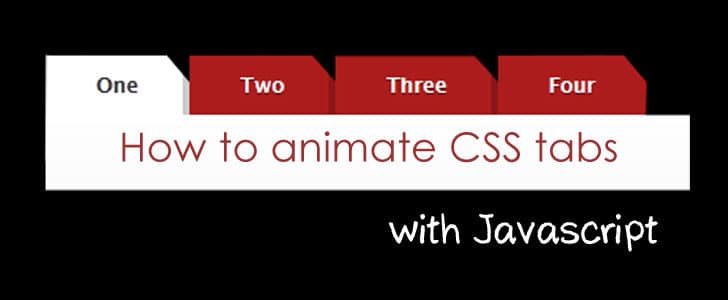
    In my previous tutorial I have explained How to create a simple tab design in CSS. Today we’ll learn about making the tabs work!

    If you take websites with tabbed design, most of them will usually refresh the page when displaying the content of that particular tab or simply link the tab with another page. But this is very annoying sometimes and does not offer a good user experience.

    tab_animate-3394552

    Here are some examples:

    Commonwealth Bank:

    http://www.commbank.com.au/

    Pizzahut:

    http://www.pizzahut.com/

    So, in order to make the maximum use of the tabbed design, we can display the content relevant to a selected tab in the same page without having to refresh/reload or linking with another. How cool is that?

    Today I will explain you how to make your tabs work, without refreshing the page, using Javacript! It’s true that you can download different Javascript libraries that will animate the tabs for you, but have you ever considered writing your own code for that? It’s no rocket science. If you are familiar with the basic Javascript then you can try this out yourself!

    For this purpose we will be using the tabbed design we created in the previous Article.

    Ok, here’s what should happen when clicking on tabs. When I select a particular tab menu, it should display the tab content DIV relevant to that and hide the rest of the tabs.

    For this we will be making use of the CSS Style attribute ‘display’.

    First Step

    As the first step I will rename my tab menu list with proper id’s like below:


            Content in Tab 01 goes here.
            Content in Tab 02 goes here.
            Content in Tab 03 goes here.
            Content in Tab 04 goes here.


    Second Step

    Next we have to write a simple function in Javascript that will display the relevant DIV and hide the rest. I am going to write this function in the simplest way.

            function animate_tab(menuId){
                    if(menuId == 'menu-01'){
                            document.getElementById('tab-01').style.display = 'block';
                            document.getElementById('tab-02').style.display = 'none';
                            document.getElementById('tab-03').style.display = 'none';
                            document.getElementById('tab-04').style.display = 'none';
                            document.getElementById('menu-01').className = 'selected';
                            document.getElementById('menu-02').className = 'unselected';
                            document.getElementById('menu-03').className = 'unselected';
                            document.getElementById('menu-04').className = 'unselected';
                    }else if(menuId == 'menu-02'){
                            document.getElementById('tab-01').style.display = 'none';
                            document.getElementById('tab-02').style.display = 'block';
                            document.getElementById('tab-03').style.display = 'none';
                            document.getElementById('tab-04').style.display = 'none';
                            document.getElementById('menu-01').className = 'unselected';
                            document.getElementById('menu-02').className = 'selected';
                            document.getElementById('menu-03').className = 'unselected';
                            document.getElementById('menu-04').className = 'unselected';
                    }
            }
    

    Likewise add more ‘else if’ blocks to the function to animate all your tabs.

    Next we have to call this function when a tab menu is clicked. So for that we are going to replace our

  • tag with the following:
  • Note that the ‘#’ in the href attribute was replaced by ‘javascript:void(0);’. This is a good practice when we want to block the usual function of an anchor tag and call a javascript instead.

    Likewise replace the other

    • tags too accordingly.

      Now you will see that the tabs are actually working without having to reload the page! But if you take a look at the javascript function you will see that lots of lines of code had been repeated several times. This is not considered as a good practice. So I’m going to offer you a more generic algorithm to do the same with lesser number of lines.

      Here’s the modified function.

      function animate_tab(menuId){
              var no_of_tabs = 4+1;
              for(i = 1; i < no_of_tabs; i++){
                      menu_id = "menu-0"+i.toString();
                      tab_id  = "tab-0"+i.toString();
                      if(menu_id == menuId){
                              document.getElementById(menu_id).className  = 'selected';
                              document.getElementById(tab_id).style.display = 'block';
                      }else{
                              document.getElementById(menu_id).className  = 'unselected';
                              document.getElementById(tab_id).style.display = 'none';
                      }
              }
      }

      Here you will see in the first line I have specified as ‘var no_of_tabs = 4+1’. 4 is the number of tabs and I have added 1 more so that it will be easier to write the condition in the’ for loop’ subsequently.

      menu_id = "menu-0"+i.toString();
      tab_id  = "tab-0"+i.toString();

      What I have done here is, I have dynamically constructed the tab name and the menu name of each tab with the iterating variable of the ‘For Loop’.

      And there you go! You have an animating CSS tab. Download example Here.

      • Hardware: Intel Core i5 2nd Gen // 4GB DDR2
      • OS: Windows 7 Home Premium // 64 Bit
      • Browser: Google Chrome Version 23.0.1271.91 m

      The beauty of this piece of code is that when compared to the previous version, if you want to add more tabs the changes you have to do are minimal.

      Try this out yourself and share your comments with us.

      Tags: #CSS #Design #JavaScript #Web

    How to Save Your Facebook Timeline from Spamming?

    Number of Facebook users is reaching the 1 billion milestone. It’s already reached World number 1 in Alexa traffic ranking. Numbers are astronomical and Facebook is continuing to become an important part in human life.

    Facebook is a once in a Millennium invention. But same as any other innovations, Facebook is also having a dark side. Actually it’s a representation of human society. Most of the inappropriate behaviors in real life could be found in Facebook as well.

    One of the major problems you will face in FB is spamming. There are many types of it. Message spamming, timeline post spamming, Tag spamming etc. In order to get rid of them what you should basically do is not to add unknown profiles as your friends. But it may not be the best solution.

    If you need better control over spam, solution is in the box. Facebook provides most updated and comprehensive security features. But unfortunately, most of the people are not using them right. I’m leaving this note to help you to save your Timeline from spamming by altering privacy settings.

    how-to-save-your-facebook-timeline-from-spamming-7886292

    Stop Tag Spamming and Timeline Post Spamming?

    These are the most annoying type of FB spam. You won’t be able to prevent them. But at least you can prevent them by appearing on your timeline without your approval. Here is how to do it.

    • Go to Facebook and sign in.
    • In top navigation bar, next to home button, there is a drop down menu. Go to Privacy Settings through that.
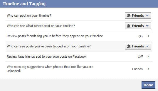
    • Go to edit settings in Timeline and Tagging.

    facebook-timeline-and-tagging-6052370

    • Set Who can post on your time line to Friends. If you have lots of annoying friends set it to No one.

    facebook-profile-review-8657772

    • Switch on Review posts friends tag you in before they appear on your timeline. After that even if someone tag you in a photo or post, it need your approval before it appear on your timeline.

    Other than above, make sure you have used most narrow down visibility options for your profile and its content. My best suggestion is only friends. Whenever you see a spam content anywhere in FB, always remember to report them as spam.

    With the above settings you can save your timeline by spam posts and tags. I love to keep a clean timeline and I know you do too. I’m sure this setting will work for you and save a huge amount of time.

    Tags: #Facebook #Social Networks #Spam

    How to Disable Hibernate in Windows 7?

    Hibernate is a useful power saving mechanism in Windows platform. When the computer is in hibernate it lets you save all the data in RAM to hard disk drive persistently and switch off the computer. Then you can switch on the computer with exact same settings and opened applications.

    In order to hibernate, your computer consumes few gigabytes of hard disk space and it’s permanently allocated. If you don’t want the hibernate feature, you can empty that space and use it for some other work.

    how-to-disable-hibernate-in-windows-7-8705963

    I was going through the windows control panel and could not find how to disable hibernate feature and free that space. Narrow shot, I tied to delete the hibernate.sys file and failed.

    Few days ago we used the DOS command “powercfg” to get energy consumption report and suggestion to improve.

    Quick Catch-up

    • How to Save Your Laptop Battery Life?

    We can use the same command to disable hibernate feature. Now you know what kind of magic you can do with Command prompt.

    Disable Hibernate

    • Go to Start Menu -> All Programs -> Accessories -> Command Prompt
    • Run Command prompt as Administrator (right click on it and select “Run as Administrator”)
    • Type the command, powercfg –h OFF
    • This will disable the hibernate feature.
    • Here after you won’t be having hibernate function in power management window.
    • Now restart the computer.
    • Now you won’t be able to see hibernate.sys file in your system drive.
    • If you can still see it, simply delete it.
    • Now you have successfully disabled hibernate and free the hard disk space.

    Control the Hibernate File size

    If you want to keep hibernate function, but consuming limited amount of hard disk space, you can use –size switch in powercfg command.

    • Open command prompt as administrator
    • Type command powercfg –h –size 60
    • This will allocate hard disk space only as 60% of RAM.
    • Minimum amount you can enter is 50%.
    • Hardware: Intel Core i5 2nd Gen // 4GB DDR2
    • OS: Windows 7 Home Premium // 64 Bit

    Tags: #Windows

    BlackBerry OS 10 – A Grand Come Back

    Couple of years ago in the business world the main choice of Smartphone was BlackBerry. The main reason behind this was its typing experience. Most of the popular BlackBerry phones were having physical QWERTY keyboard.

    Due this innovative feature it made BlackBerry a good device to handle email, To Dos and notes. Of course this attracted lots of business community and professionals rather than general public. With the time having a BlackBerry became an exponential fashion trend.

    However with the introduction of iPhone and Android Phones, BlackBerry could not stand tall in the market anymore. The main reason was its operating system and its limited capabilities. iOS and Android was having way more advanced capabilities and was delivering a great on-screen typing experience which burnt the BlackBerry fortress to ground.

    backberry-os-10-a-great-come-back-8746568

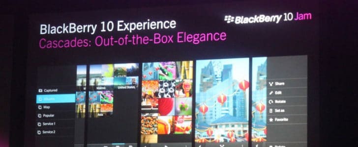
    Couple of weeks ago, in BlackBerry World 2012 event, they demonstrated new BlackBerry OS 10. There I could notice some promising features which might be able to give a solid competition to Android and iOS as well.

    Features Spotlight

    Flow UI

    The application support is the major success factor in any mobile OS. In the early time iOS didn’t support multitasking and even today, it doesn’t have true multitasking capabilities. If you take a look at Android, it’s true multi tasking platform.

    In BalckBerry OS 10 they have came up with even better multitasking platform and well streamlined interface to support that as well. They call it the “Flow” UI.

    The BlackBerry OS 10 is capable of running many applications at the same time. Most interesting part here is they are not just paused there in back ground, they are actually running.

    If you want to switch to other applications running, there is a special gesture. You can swipe the current application to the side and you can see all the other running application behind that. If there is any process going on in application behind the current one, you will be able to see the real time updates. Notification also could access in the right panel while you are running any application.

    flow-ui-4762946

    Keyboard

    Keyboard was always special for BlackBerry Phones. Previously they mater the physical QWERTY keyboard and now they war trying to compete in on screen keyboard as well.

    The keyboard they layout they demonstrated is pretty much standard and looks almost alike to Anroid keyboard. You can swipe it down to get the number pad easily.

    The most unique feature here is predictions. You can find the same feature in Android keyboard as well. There it displays suggested word in a row on top the keyboard. Here the magic is the suggestions are coming on top the relevant key. All you have to do is fly them up to the text editor.

    keyboard-3214141

    This is my favorite feature in BlackBerry OS 10. This keyboard layout is advanced application we never witnessed and as it appears on the demo it’s way better than android keyboard and iOS keyboard. I sense a solid competition here.

    Time Shifting Camera

    Another interesting feature which was there in demo is the “Time shifting camera”. Of course camera is playing an important role in success of any Smartphone and seems BlackBerry has understood it. Time shifting camera is taking series of images once to click the button. Then you can rewind a specific part of the image frame by frame till you get the optimum out come.

    Here is a video demonstration how it’s going to happen.

    Wrapping Up

    I identify this new BlackBerry OS 10 as a great come back of a dying trend. Most of the features they have demonstrated here are very unique and not be able find the same thing in any other mobile OS. Mainly engineers have put extra effort to deliver a great typing experience to the user following previous BlackBerry philosophy.

    Even when you take a look at the camera features, they are very unique, never seen and never thought of. The main objective seems to save time of the users, probably to attract previous business community went away from BlackBerry for Android and iOS.

    It’s too early and not enough data to jump in to any conclusion. However what I could see was promising and good enough fuel for solid competition for Android and iOS.

    Tags: #BlackBerry #OS

    How to Change the Mouse Hover Time for Taskbar Preview?

    Once Windows Vista came to market, the main attraction there was the ‘Aero’ theme. It was a new experience to Windows users. However, due to severe performance bottlenecks Windows Vista was a huge failure.

    However Microsoft never stepped back and came up with Windows 7 solving all the major performance issues that were there in Windows Vista. Now we can really enjoy the Windows Aero Experience.

    how-to-change-the-mouse-hover-time-for-taskbar-preview-3446245

    One of the most attractive features in aero theme is live preview of Minimized tasks. When you take your mouse over to a minimized task in task bar, after certain period of time you can see a small preview of that window. The most interesting part is you can see all the live updating content in the preview. If it’s a video, you can see it plying.

    The default time it takes to pop up preview is 400 milliseconds. If you want to change the time it takes to show you the preview, unfortunately there is no standard Windows setting. For that you have to tweak the Windows registry. Here is how to do it.

    Steps to Follow

    • Click on start button and type “regedit
    • It will take you to Windows registry editor.
    • There you have to go to KEY_CURRENT_USERControl PanelMouse.
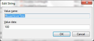
    • In the right had side panel, find the entry “MouseHoverTime
    • You can see the default value there is 400.
    • Double click on it. It will give you a pop up.

    edit-7804545

    • Change the value as you want. 100 millisecond worked good with me.
    • Click OK and close the Windows registry editor.
    • Restart your computer and try to get task preview. Now it’s taking only 100 milliseconds.
    • This change is applicable to all the move hover events such as Tool tip display.
    • Hardware: Intel Core i5 2nd Gen // 4GB DDR2
    • OS: Windows 7 Home Premium // 64 Bit

    Note: Be careful when you tweak the windows registry. One mistake may lead your system to instability or total crash. Make sure you change the value only if you know what it exactly does.

    Tags: #Windows