When you are designing a website how many times have you attempted to design the menu navigation on your own? Most of the time you will either use the same menu design that came with the template you downloaded or simply copy + paste a code found through the internet.
But today I’m going to show you how to create a 3D drop down menu using ONLY CSS! Yes, you will not need any Javascript or jQuery libraries for this.
Getting started
As the first step of the design, we have to create our menu structure in HTML. Here I will be using the
- tag.
- Menu 01
- Sub Menu 1/1
- Sub Menu 1/2
- Menu 02
- Sub Menu 2/1
- Sub Menu 2/2
- Sub Menu 2/3
- Menu 03
- Sub Menu 3/1
- Sub Menu 3/2
- Sub Menu 3/3
- Sub Menu 3/4
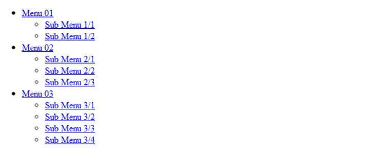
And the outcome will be as follows:
Applying Styles
Now let’s add some styling to the design.
Open a tag within your section.
First of all I will add a background color, remove the underline of the links and do some formatting.
body{
        padding:50px;
        background: #000000;
        }
#menu-bar, #menu-bar ul, #menu-bar li{
        padding:0;
        margin:0;
        }
#menu-bar li a{
        text-decoration:none;
        color: white;
        }
Then I will specify how the list items should appear in our menu design.
#menu-bar li{
    list-style: none;
    position: relative;
    float: left;
    width:150px;
    height: 50px;
    text-align: center;
    background-color: #cc99cc;
    line-height: 50px;
    }
Note the following lines.
position: relative;
float: left;
These two lines make our unordered lists appear horizontal.
Then I am going to specify a different color for the menu items when the mouse it pointed. This is called the ‘Hover Effect’.
#menu-bar li:hover{
    background-color: #cc33cc;
    }
Finally I am going to hide the sub menus and make them visible only when the mouse is pointed.
#menu-bar ul ul{
    top:0;
    visibility:hidden;
        }
#menu-bar ul li:hover ul{
    visibility:visible;
    }
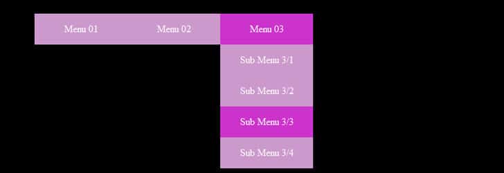
And voila! We have created a simple drop down menu.
Adding the 3D Effect
You can always use the simple menu as it is. But wouldn’t it be so much better if we can add some 3D effect to the menu? It would provide a much better user experience.
The best part is, you can get an amazing 3D effect by changing just 01 line of the stylesheet!
First create an image of size 150px X 50px (the size of a list item) with an image editor. Add some embossed effect or a glow.
Save the image in Portable Network Graphics (png) format. (In my example I have saved the image as ‘menu-bg.png’ in the ‘images’ directory)
Then comment out the code in ‘#menu-bar li:hover’ and add the following:
#menu-bar li:hover{
    /*background-color:#cc33cc; */
    background: url(images/menu-bg.png);
    }
Also to make the menu look more realistic, I am going to add a small arrow pointing downwards along with the main menu items.
You can do that by simply adding the arrow image within the list item as follows:
- Sub Menu 1/1
- Sub Menu 1/2
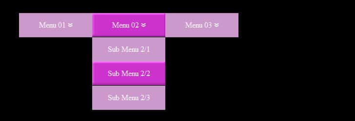
And this is how your 3D menu will appear.
Let’s Create a Vertical Menu Too!
You can also create a vertical menu using the same style sheet. Just do the below changes.
Comment out ‘float:left’ in ‘#menu-bar li’.
#menu-bar li{
    list-style: none;
    position: relative;
    /*float: left; */
    width:150px;
    height: 50px;
    text-align: center;
    background-color: #cc99cc;
    line-height: 50px;
    }
Add the position to the sub menus and indent it 150px from the left (so that you leave enough space for the main menu).
#menu-bar ul ul{
    top:0;
    visibility:hidden;
    position: absolute;
    left:150px;
    }
The vertical menu will appear like this.
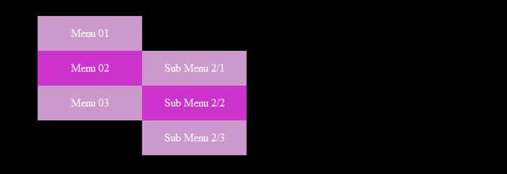
You can download the source files for all the above examples from here.
- Hardware: Intel Core i5 2nd Gen // 4GB DDR2
- OS: Windows 7 Home Premium // 64 Bit
- Browser: Google Chrome Version 23.0.1271.91 m
Now that you won’t have to scavenge for codes in the internet, try this out yourself and let me know how it went.
Tags: #CSS #Web
