When you are surfing WWW you must have noticed that most of the latest web designs are having round corners in rectangular shapes. Sometime ago you had no option but use an image to get such shapes. But now with CSS 3 you have border-radius attribute which let you to design round corners with much less effort at the same time in a performance optimized way.

However, using border-radius you can do much more than creating round corners. Here we are trying to create few circular shapes with border-radius which will definitely add new creative possibilities to your future web designs.
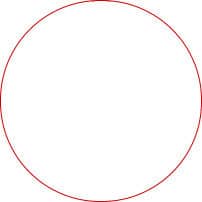
Circle
- Create new HTML File.
- Create a div tag with id “circle”.
- In order to write internal CSS create a tag in . (You may use an external CSS too)
- Write the below CSS in tag.
#circle{
        border:solid 1px #c00; /* To make the border visible*/
        width:100px;
        height:100px; /*Now you have a square*/
        border-radius:50%; /*Here we go with circle*/
        }
- If you face any browser compatibility issues with percentage you can use below code.
border-radius: 50px;
- Outcome would look like this.

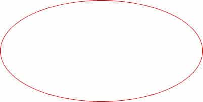
Oval
- You only have to change the width of rectangle to 200px.
- The CSS code will looks like this.
#circle{
        border:solid 1px #c00; /* To make the border visible*/
        width:200px;
        height:100px; /*Now you have a rectangle*/
        border-radius:50%; /*Here we go with circle*/
        }
- Same as before if there is an issue in using percentage you can use below code.
border-radius:100px/50px;
- Here we are separately controlling horizontal radius and vertical radius to get the oval.
- Outcome would looks like this.

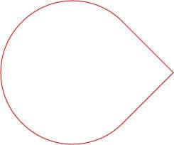
Other Shapes
- You can change the border radius on every corner individually.
- For that you can use the below code
border-radius:100px 0px 100px 100px
- First value is top left corner and then it goes clock wise.
- Then you can use transform attribute to rotate the shape using below code.
transform:rotate(45deg);

- Click here to download the example.
- Hardware: Intel Core i5 2nd Gen // 4GB DDR2
- OS: Windows 7 Home Premium // 64 Bit
- Browser: Google Chrome Version 23.0.1271.91 m
Browser Compatibility
As a result of browser battle there are various browser specific CSS 3 attributes. They never like to wait till the global standard comes. Instead they came up with their own CSS attributes. And it became the worst nightmare for web developers.
When you are using border-radius, yes you will run in to serious browser compatibility issues. The best way to solve the problem is be prepared for every browser. That means write rules for every browser.
See the below example.
border-radius:50px;
-moz- border-radius:50px;
-webkit-border-radius:50px;
Now you have the guarantee that this CSS code will get interpreted by most of the modern browsers. There are many other browser specific prefixes such as –o and –ms. You will have to duplicate the same code using those prefixes in case you need expanded browser compatibility.
Tags: #CSS #Web
